Data visualization

Below is a collection of projects and articles related to data visualization and analysis. You can also view my Tableau profile, my datasets on Kaggle, and my Makeover Monday submissions.
Big wall of text, showing a portion of the data extracted from the botโ€™s posts on Mastodon as a JSON object.
One year of @WikipediaTopEdits article

A look at one year's worth of edits of the English Wikipedia.

๐Ÿ“… 5 days ago

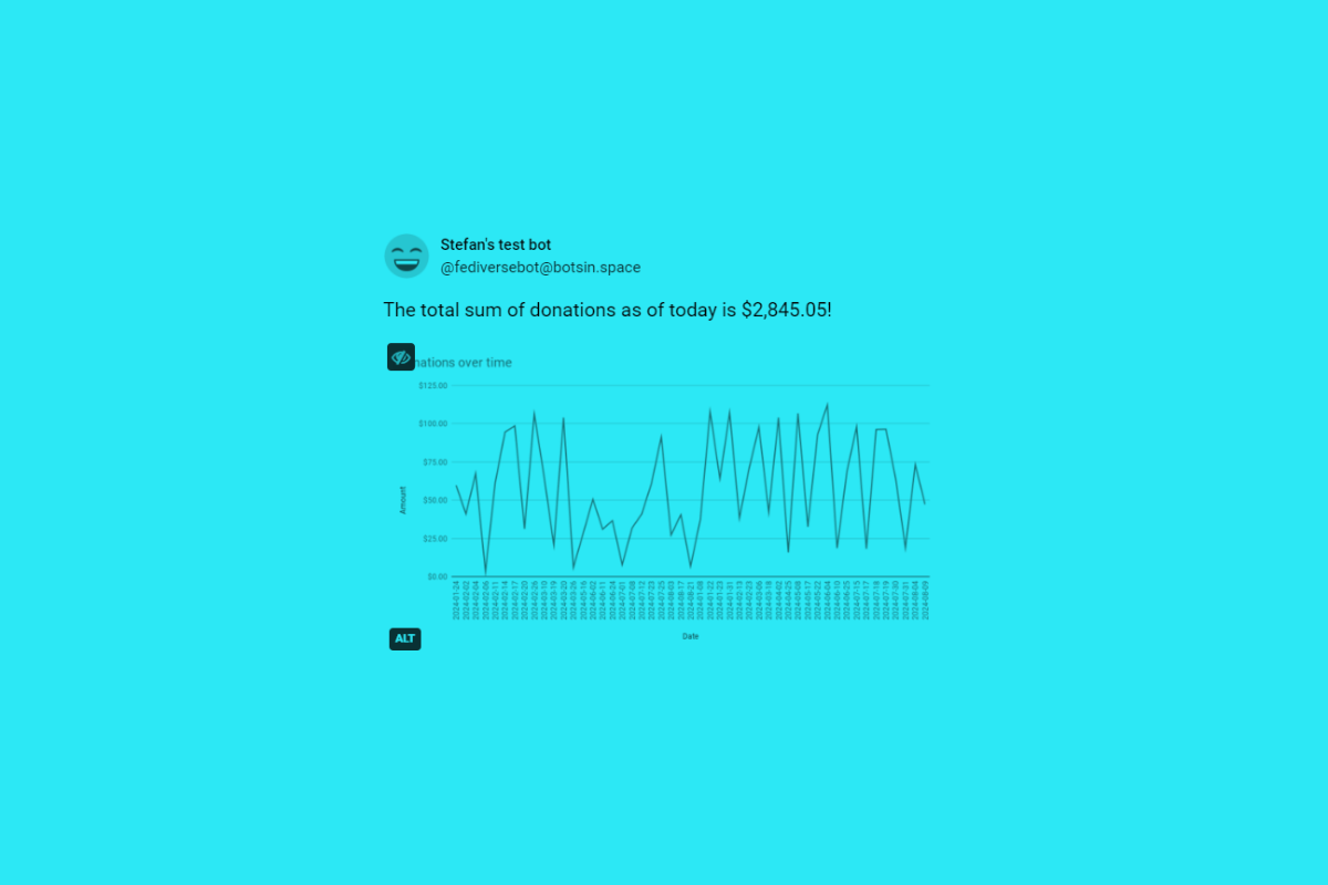
A Mastodon post from a test bot account showing an image of a line chart attached.
Making a Mastodon bot with Google Sheets and Apps Scripts: Part 2 article

Now with a chart!

๐Ÿ“… a month ago

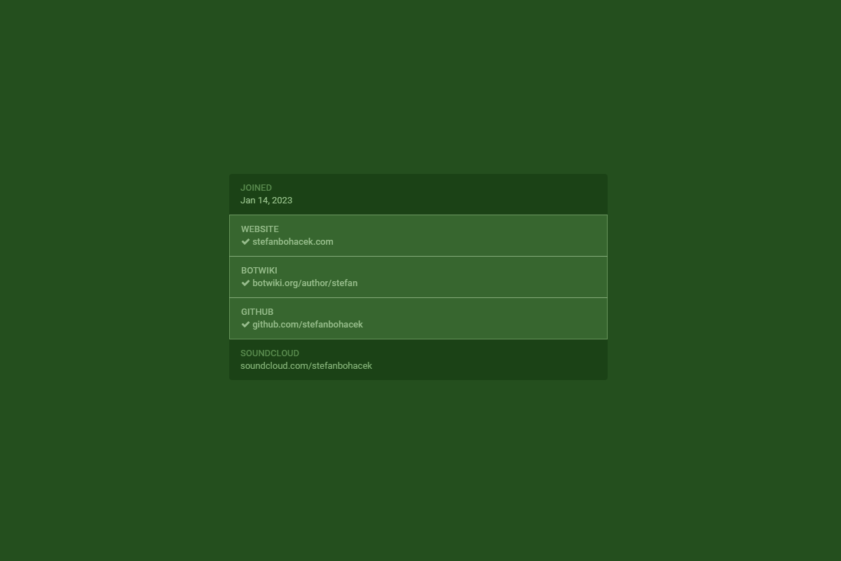
A tinted screenshot of a portion of a Mastodon profile page showing a list of four links, three of which are verified.
Verification in the fediverse article

Analysis of the link verification feature in the fediverse.

๐Ÿ“… 3 months ago

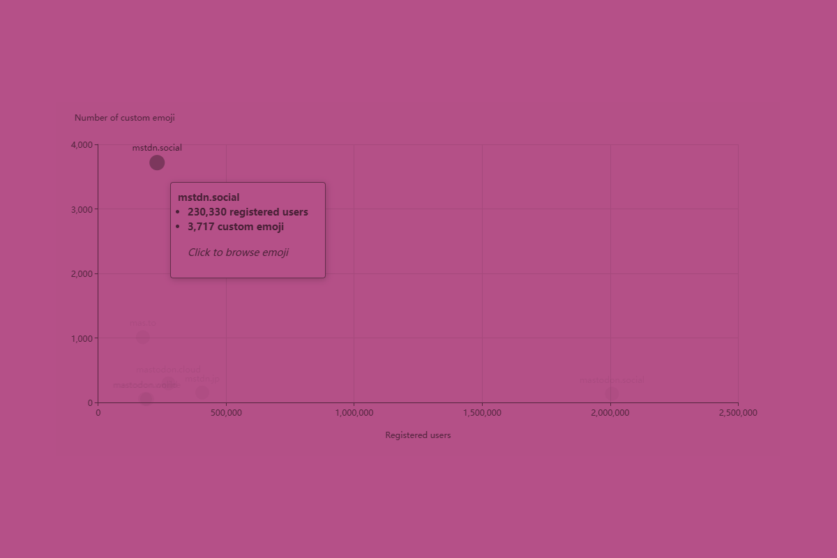
A scatter chart showing several popular fediverse servers laid out on a grid, with x axis representing number of registered users, and y axis representing the number of custom emoji on each server. The data point for mstdn.social is highlighted showing the corresponding data and a prompt to click the data point to browse the emoji.
Custom fediverse emoji article

A look at custom emoji used across the fediverse.

๐Ÿ“… 3 months ago

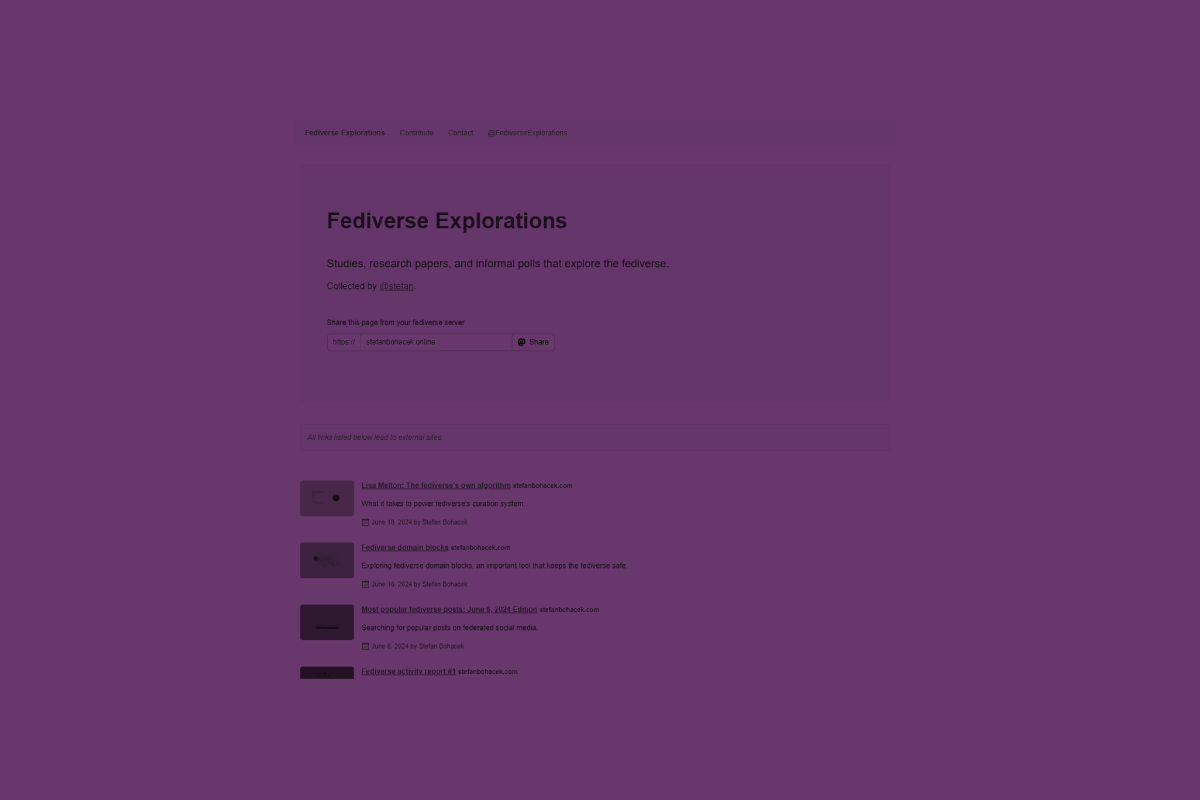
A tinted screenshot of the fediverseexplorations.org website, showing the page title, description, and a list of studies.
Fediverse Explorations project

Exploring the fediverse through data, studies, and polls.

๐Ÿ“… 4 months ago

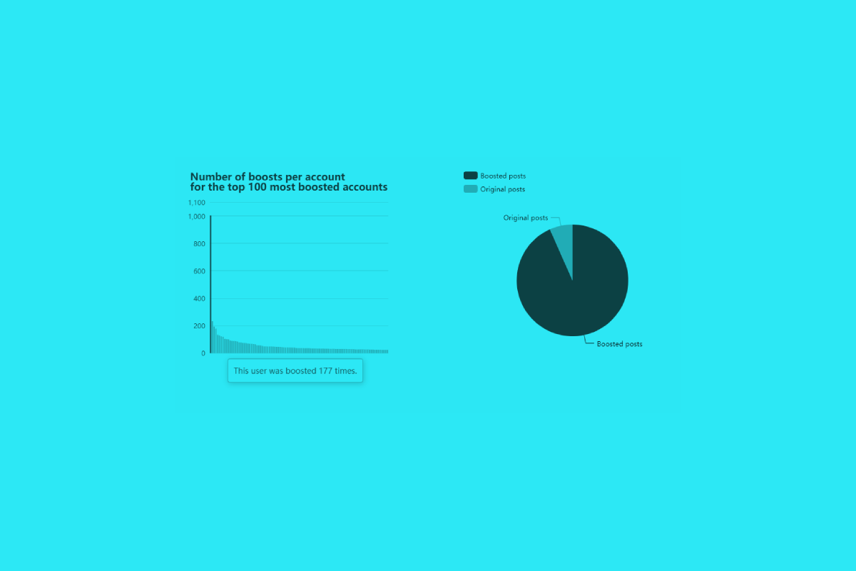
A pair of two charts: a bar chart showing number of boosts per account for the top 100 most boosted accounts, and a bar pie chart showing the breakdown of original and boosted posts, heavily skewed towards boost.
Lisa Melton: The fediverse's own algorithm article

What it takes to power fediverse's curation system.

๐Ÿ“… 4 months ago

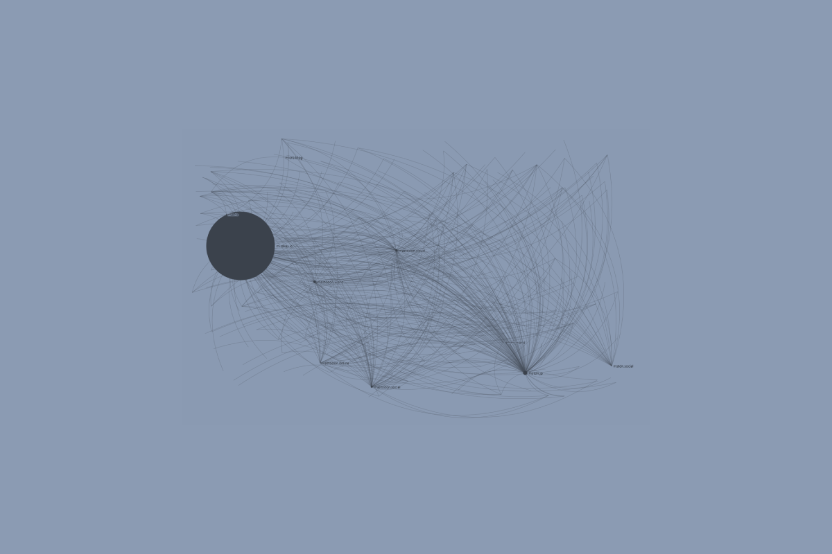
A graph chart with nodes representing different fediverse servers. The servers that are the focus of this study are shown in size based on the total number of users on instances blocking each server.
Fediverse domain blocks article

Exploring fediverse domain blocks, an important tool that keeps the fediverse safe.

๐Ÿ“… 4 months ago

A tinted screenshot of a bar chart with three columns, with the bottom of each column shaded a darker color.
Which top sites block AI crawlers? article

Not many want their content turned into "slop".

๐Ÿ“… 4 months ago

A color-tinted screenshot of a scatter chart showing the distribution of fediverse posts from April 23, 2023 to June 10, 2024 based on the number of likes. Most of the data is clustered in the 0 to 1,000 likes range, with a few posts in the 2,000 to 3,000 likes range, and even fewer above that. 5 posts are in the top 5,000 to 6,000 range, most of those posted in July 2023.
Most popular fediverse posts: June 6, 2024 Edition article

Searching for popular posts on federated social media.

๐Ÿ“… 4 months ago

A color-tinted collage of a very long bar chart that was cut up to make each section with its title visible.
Fediverse activity report #1 article

Is the activity in the fediverse slowing down? Maybe a little!

๐Ÿ“… 4 months ago